This is my final product of my front cover.
Friday, 12 December 2014
Wednesday, 10 December 2014
Contents Progress Onto Front Cover
Contents:
This is the process of me applying my features to my front cover.
Step 1-
Step 2-
Step 3-
Step 4-
This is the process of me applying my features to my front cover.
Step 1-
I added a variety of effects to the letters on my cover stories. To make the letters closer together and the shape the letters, I have changed the characters. I also changed the angles of the letter placement to see if this would be effective, however it wasn't effective.
Step 2-
I changed the placement and size of my main headline to try and find one which would be effective. Also I changed the style of the font but I kept the colour red the same because I felt this fitted in well with my masthead and supporting articles.
Once I had decided the size, placement and font of my main headline I applied some effects to it. This appeared to be very effective as it made the main headline stand out.
Step 4-
To make sure all the features are in line which each other, I used rulers. This was very effective in making the magazine look realistic as everything lined up together.
For the plug I added effects to the Vinyl record and added the word FREE across it. I angled the lettering to give the effect of a stamp across the plug.
The barcode was originally without a blue background however I took inspiration from a Mojo magazine which placed a box around the barcode and I felt it was very effective. I chose the colour blue because this matched my masthead.
Friday, 28 November 2014
Masthead Process Onto The Front Cover
Masthead:
This is the process of me applying my masthead to my front cover.
Step 1-
When I first applied my image and masthead together I noticed that it would look better if the top of the models hat went over the masthead. In order to do this I needed to crop the top of a hat from a previous image. To do this I used the 'Polygonal Lasso Tool' then I cut out a selection of the image. I then applied the top of the hat onto my main image and applied some effects so it blended into the main image.
Step 2-
In my mock up I decided to place a bright red background against the back of my masthead. However now I have applied my editing image to the masthead I have chosen to change the colour of the background. These are a few examples:
Step 3-
The colour that went really well against the main image and the black writing of the masthead was the colour blue. Once I knew the background colour of the masthead, I placed the slogan in different places. This is because I wanted to make sure the slogan was situated in the right position.
I also added some effects to the slogan to make it stand out against the background of the colour blue.
I placed the slogan underneath the word , 'YEARS. This is the best position of the slogan as it doesn't overlap with any other features of the magazine, also it makes it more noticeable.
Step 4-
The words in my masthead needed to stand out. Therefore I added some effects to the text. I think this has been really effective in making the text 3D.
This is before and after I applied effects to the text. This is also the end product of my masthead production.
Thursday, 27 November 2014
Editing Main Image
Main Images:
Out of all the images I took, these are the best 8 images which I could apply to the front cover of a magazine. Therefore I have chosen my best image from these to apply to my mock ups.
Favourite Image:
This is my favourite image because it has room around the sides to place my cover stories. I also asked my peers to decide which image was there favourite too and the majority went with this image. I think it has captured the model really well. I am going to edit this image, such as changing the contrasts and brightness.
Editing the image:
I edited the image in a variety of ways.
The areas in which I edited were:
-Lips
-Teeth
-Eyes
-Trousers
-Belt
-Contrasts
The areas in which I edited were:
-Lips
-Teeth
-Eyes
-Trousers
-Belt
-Contrasts
Wednesday, 26 November 2014
Google Mock Ups
These are my 3 Google Mock Ups
Google Mock Up 1:
Google Mock Up 2:
These Are My Analysis Of Each Mock Up
Google Mock Up 1:
Google Mock Up 2:
Google Mock Up 3:
Sunday, 16 November 2014
Name Of Website
To make a website name for my magazine , I entered my chosen name into a website named 123-reg.co.uk
Unfortunatley the name www.vinylyears had already been selected therefore I changed it to www.vinylyearsmagazine.
Saturday, 15 November 2014
Survey Monkey - Research
Survey Monkey Results - Put Into Practice
From my survey monkey results I have done some research into the results.
Firstly I asked the question on how people consume music and how many times a week they listen to music.
This is the link to the website which plays 60s music on the radio:
http://absoluteradio.co.uk/60s/
Friday, 14 November 2014
Taking My Images
Images:
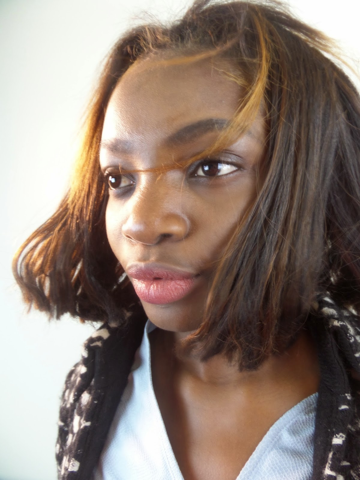
These are all of the images I took during my photo-shoot. I took over 300 images because I wanted to make sure I found the right clothes, placement and posture of the model to suit my main image on the front cover of my magazine.
I only shot my images in one place because I didn't want a scenic backdrop for my front cover.
Lighting:
This is how I set the room out which I used to shoot all of my images:
This is before lighting has been applied:
This is after lighting has been applied:
I used the following props with my model:
-A snood
-Sunglasses
-Fan
-A pink necklace
-Masquerade masks
-Fascinators
-Belt
-A brown hat
-A skirt
Also I placed my model in different positions and changed some items of clothing.
Positions:
I started off placing my model in different positions but I felt the it didn't show any of the models emotions.
Jacket:
I added a jacket to my model , however I don't think this was very effective. It made the model look uncomfortable and I don't like the position of the hair (in a ponytail).
Glasses:
I added sunglasses to my model but this didn't fit into the my chosen genre.
Phone:
I added a phone into the image but I didn't feel this was effective in capturing the model's emotions. However the phone did have a vintage feel which would have suited my genre very well.
I placed a pink necklace around my model and it worked really well. Unfortunatley on reflexion I didn't think the images would work well on the front cover of my magazine.
The masquerade mask captured the model's eyes really effectively however to use as the image for my front cover, wouldn't work very well.
Bunny Ears:
I tried some bunny ears onto my model, but this was irrelevant to my genre.
Fan:
I used a fan to make the hair of my model look like it was in the wind. This is not suitable for my genre though and the photos I took didn't give this off this effect.
I placed my model in different positions on the floor. This worked well as it captured the emotions of the model. Unfortunatley this isn't suitable for my front cover.
Fascinators:
I used two types of fascinators, my favourite is the black one because this suited the model. I then placed my model in different positions to show different angles of the fascinators.
I paired these two types of props together to create a different style.
Over The Shoulder Jacket:
I placed a blazer of the model's shoulder, to give a relaxed and chilled image of the model. This didn't have the correct effective for my magazine.
Hat:
A hat has been used to show a quirky side to the model. These images have been really effective.
Full Body:
I took some long shots to show the full length of my model. These images may be suitable for my contents page.
Subscribe to:
Posts (Atom)