Friday, 28 November 2014

Masthead Process Onto The Front Cover

Masthead:
This is the process of me applying my masthead to my front cover.

Step 1-
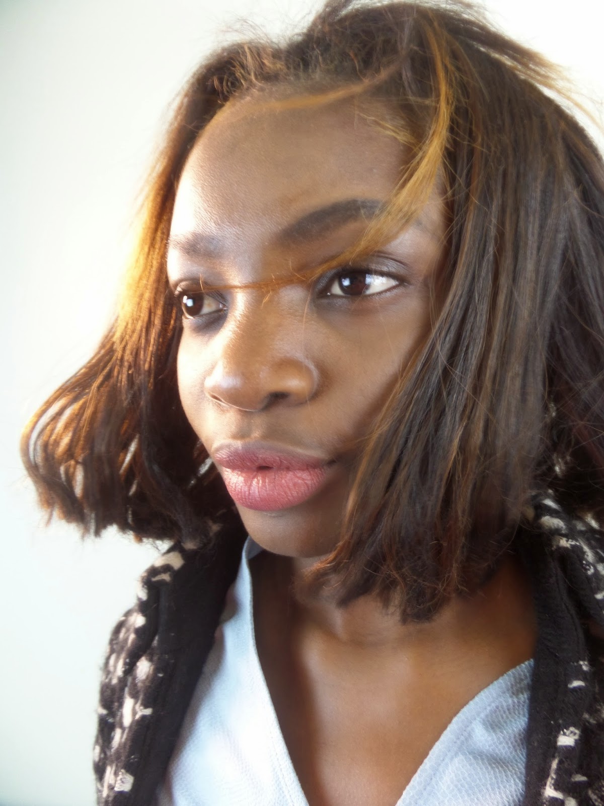
When I first applied my image and masthead together I noticed that it would look better if the top of the models hat went over the masthead. In order to do this I needed to crop the top of a hat from a previous image. To do this I used the 'Polygonal Lasso Tool' then I cut out a selection of the image. I then applied the top of the hat onto my main image and applied some effects so it blended into the main image.

Step 2-
In my mock up I decided to place a bright red background against the back of my masthead. However now I have applied my editing image to the masthead I have chosen to change the colour of the background. These are a few examples:

Step 3-
The colour that went really well against the main image and the black writing of the masthead was the colour blue. Once I knew the background colour of the masthead, I placed the slogan in different places. This is because I wanted to make sure the slogan was situated in the right position.
I also added some effects to the slogan to make it stand out against the background of the colour blue.
I placed the slogan underneath the word , 'YEARS. This is the best position of the slogan as it doesn't overlap with any other features of the magazine, also it makes it more noticeable.

Step 4-
The words in my masthead needed to stand out. Therefore I added some effects to the text. I think this has been really effective in making the text 3D.

Step 5-
This is before and after I applied effects to the text. This is also the end product of my masthead production.


Thursday, 27 November 2014

Editing Main Image

Main Images:
 
Out of all the images I took, these are the best 8 images which I could apply to the front cover of a magazine. Therefore I have chosen my best image from these to apply to my mock ups.
Favourite Image:


This is my favourite image because it has room around the sides to place my cover stories. I also asked my peers to decide which image was there favourite too and the majority went with this image. I think it has captured the model really well. I am going to edit this image, such as changing the contrasts and brightness.
 
Editing the image:
I edited the image in a variety of ways.
The areas in which I edited were:
-Lips
-Teeth
-Eyes
-Trousers
-Belt
-Contrasts


YouTube Research


Wednesday, 26 November 2014

Google Mock Ups

These are my 3 Google Mock Ups
 
Google Mock Up 1:
 

Google Mock Up 2:

 
Google Mock Up 3:

 
These Are My Analysis Of Each Mock Up
 
Google Mock Up 1:
 
 
Google Mock Up 2:

 
Google Mock Up 3:


Sunday, 16 November 2014

Name Of Website

To make a website name for my magazine , I entered my chosen name into a website named 123-reg.co.uk


 Unfortunatley the name www.vinylyears had already been selected therefore I changed it to www.vinylyearsmagazine.


Saturday, 15 November 2014

Survey Monkey - Research

Survey Monkey Results - Put Into Practice           

From my survey monkey results I have done some research into the results.

Firstly I asked the question on how people consume music and how many times a week they listen to music.


This is the link to the website which plays 60s music on the radio:

http://absoluteradio.co.uk/60s/


Friday, 14 November 2014

Taking My Images

Images:
 

These are all of the images I took during my photo-shoot. I took over 300 images because I wanted to make sure I found the right clothes, placement and posture of the model to suit my main image on the front cover of my magazine.

I only shot my images in one place because I didn't want a scenic backdrop for my front cover.

Lighting:

This is how I set the room out which I used to shoot all of my images:

 
This is before lighting has been applied:
 
 
This is after lighting has been applied:

 
Props: 
I used the following props with my model:
-A snood
-Sunglasses
-Fan
-A pink necklace
-Masquerade masks
-Fascinators
-Belt
-A brown hat
-A skirt
Also I placed my model in different positions and changed some items of clothing.

Positions:
I started off placing my model in different positions but I felt the it didn't show any of the models emotions.


Jacket:
I added a jacket to my model , however I don't think this was very effective. It made the model look uncomfortable and I don't like the position of the hair (in a ponytail).


Glasses:
I added sunglasses to my model but this didn't fit into the my chosen genre.


Phone:
I added a phone into the image but I didn't feel this was effective in capturing the model's emotions. However the phone did have a vintage feel which would have suited my genre very well.


Necklace:
I placed a pink necklace around my model and it worked really well. Unfortunatley on reflexion I didn't think the images would work well on the front cover of my magazine.


Masquerade mask:
The masquerade mask captured the model's eyes really effectively however to use as the image for my front cover, wouldn't work very well.


Bunny Ears:
I tried some bunny ears onto my model, but this was irrelevant to my genre.
 
 
Fan:
I used a fan to make the hair of my model look like it was in the wind. This is not suitable for my genre though and the photos I took didn't give this off this effect.


On The Floor:
I placed my model in different positions on the floor. This worked well as it captured the emotions of the model. Unfortunatley this isn't suitable for my front cover.


Fascinators:
I used two types of fascinators, my favourite is the black one because this suited the model. I then placed my model in different positions to show different angles of the fascinators.


Fascinators and Sunglasses:
I paired these two types of props together to create a different style.


Over The Shoulder Jacket:
I placed a blazer of the model's shoulder, to give a relaxed and chilled image of the model. This didn't have the correct effective for my magazine.


Hat:
A hat has been used to show a quirky side to the model. These images have been really effective.


Full Body:
I took some long shots to show the full length of my model. These images may be suitable for my contents page.